TextSymbolizer
A TextSymbolizer styles features as text labels. Text labels are positioned either at points or along linear paths derived from the geometry being labelled.
Labelling is a complex operation, and effective labelling is crucial to obtaining legible and visually pleasing cartographic output. For this reason SLD provides many options to control label placement. To improve quality even more GeoServer provides additional options and parameters. The usage of the standard and extended options are described in greater detail in the following section on Labeling.
Syntax
A <TextSymbolizer> contains the following elements:
Tag |
Required? |
Description |
|
No |
The geometry to be labelled. |
|
No |
The text content for the label. |
|
No |
The font information for the label. |
|
No |
Sets the position of the label relative to its associated geometry. |
|
No |
Creates a colored background around the label text, for improved legibility. |
|
No |
The fill style of the label text. |
|
No |
A graphic to be displayed behind the label text. See Graphic for content syntax. |
|
No |
The priority of the label during conflict resolution. Content may contains expressions. See also Priority Labeling. |
|
0..N |
A GeoServer-specific option. See Labeling for descriptions of the available options. Any number of options may be specified. |
Geometry
The <Geometry> element is optional.
If present, it specifies the featuretype property from which to obtain the geometry to label,
using a <PropertyName> element.
See also Geometry transformations in SLD for GeoServer extensions for specifying geometry.
Any kind of geometry may be labelled with a <TextSymbolizer>.
For non-point geometries, a representative point is used (such as the centroid of a line or polygon).
Label
The <Label> element specifies the text that will be rendered as the label.
It allows content of mixed type, which means that the content
can be a mixture of string data and Filter Expressions.
These are concatenated to form the final label text.
If a label is provided directly by a feature property,
the content is a single <PropertyName>.
Multiple properties can be included in the label,
and property values can be manipulated by filter expressions and functions.
Additional “boilerplate” text can be provided as well.
Whitespace can be preserved by surrounding it with XML <![CDATA[ ]]> delimiters.
If this element is omitted, no label is rendered.
Font
The <Font> element specifies the font to be used for the label.
A set of <CssParameter> elements specify the details of the font.
The name attribute indicates what aspect of the font is described,
using the standard CSS/SVG font model.
The content of the element supplies the
value of the font parameter.
The value may contain expressions.
Parameter |
Required? |
Description |
|
No |
The family name of the font to use for the label.
Default is |
|
No |
The style of the font. Options are |
|
No |
The weight of the font. Options are |
|
No |
The size of the font in pixels. Default is |
LabelPlacement
The <LabelPlacement> element specifies the placement of the label relative to the geometry being labelled.
There are two possible sub-elements: <PointPlacement> or <LinePlacement>.
Exactly one of these must be specified.
Tag |
Required? |
Description |
|
No |
Labels a geometry at a single point |
|
No |
Labels a geometry along a linear path |
PointPlacement
The <PointPlacement> element indicates the label is placed
at a labelling point derived from the geometry being labelled.
The position of the label relative to the labelling point may be controlled by the
following sub-elements:
Tag |
Required? |
Description |
|
No |
The location within the label bounding box that is aligned with the label point.
The location is specified by |
|
No |
Specifies that the label point should be offset from the original point.
The offset is specified by |
|
No |
The rotation of the label in clockwise degrees
(negative values are counterclockwise).
Value may contain expressions.
Default is |
The anchor point justification, displacement offsetting, and rotation are applied in that order.
LinePlacement
The <LinePlacement> element indicates the label
is placed along a linear path derived from the geometry being labelled.
The position of the label relative to the linear path may be controlled by the
following sub-element:
Tag |
Required? |
Description |
|
No |
The offset from the linear path, in pixels.
Positive values offset to the left of the line, negative to the right.
Value may contain expressions.
Default is |
The appearance of text along linear paths can be further controlled
by the vendor options followLine, maxDisplacement, repeat, labelAllGroup, and maxAngleDelta.
These are described in Labeling.
Halo
A halo creates a colored background around the label text, which improves readability in low contrast situations.
Within the <Halo> element there are two sub-elements which control the appearance of the halo:
Tag |
Required? |
Description |
|
No |
The halo radius, in pixels.
Value may contain expressions.
Default is |
|
No |
The color and opacity of the halo
via |
Fill
The <Fill> element specifies the fill style for the label text.
The syntax is the same as that of the PolygonSymbolizer Fill element.
The default fill color is black (#FFFFFF) at 100% opacity..
Graphic
The <Graphic> element specifies a graphic symbol to be displayed behind the label text (if any).
A classic use for this is to display “highway shields” behind road numbers
provided by feature attributes.
The element content has the same syntax as the <PointSymbolizer> Graphic element.
Graphics can be provided by internal mark symbols, or by external images or SVG files.
Their size and aspect ratio can be changed to match the text displayed with them
by using the vendor options graphic-resize and graphic-margin.
Example
The following symbolizer is taken from the Points section in the SLD Cookbook.
 1       <TextSymbolizer>
 2         <Label>
 3           <ogc:PropertyName>name</ogc:PropertyName>
 4         </Label>
 5         <Font>
 6           <CssParameter name="font-family">Arial</CssParameter>
 7           <CssParameter name="font-size">12</CssParameter>
 8           <CssParameter name="font-style">normal</CssParameter>
 9           <CssParameter name="font-weight">bold</CssParameter>
10         </Font>
11         <LabelPlacement>
12           <PointPlacement>
13             <AnchorPoint>
14               <AnchorPointX>0.5</AnchorPointX>
15               <AnchorPointY>0.0</AnchorPointY>
16             </AnchorPoint>
17             <Displacement>
18               <DisplacementX>0</DisplacementX>
19               <DisplacementY>25</DisplacementY>
20             </Displacement>
21             <Rotation>-45</Rotation>
22           </PointPlacement>
23         </LabelPlacement>
24         <Fill>
25           <CssParameter name="fill">#990099</CssParameter>
26         </Fill>
27       </TextSymbolizer>
The symbolizer labels features with the text from the name property.
The font is Arial in bold at 12 pt size, filled in purple.
The labels are centered on the point along their lower edge,
then displaced 25 pixels upwards,
and finally rotated 45 degrees counterclockwise.
The displacement takes effect before the rotation during rendering, so the 25 pixel vertical displacement is itself rotated 45 degrees.
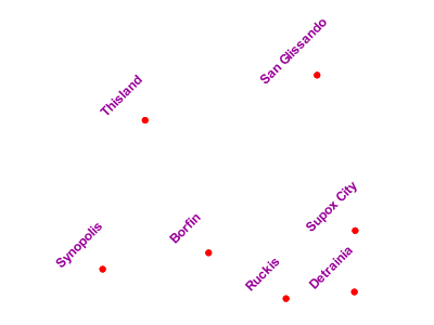
Point with rotated label
Scalable Font Size
The font size can also be set depending on the scale denominator as follows:
 1       <CssParameter name="font-size">
 2         <ogc:Function name="Categorize">
 3           <!-- Value to transform -->
 4           <ogc:Function name="env">
 5             <ogc:Literal>wms_scale_denominator</ogc:Literal>
 6           </ogc:Function>
 7           <!-- Output values and thresholds -->
 8           <!-- Ranges: -->
 9           <!-- [scale <= 300, font 12] -->
10           <!-- [scale 300 - 2500, font 10] -->
11           <!-- [scale > 2500, font 8] -->
12           <ogc:Literal>12</ogc:Literal>
13           <ogc:Literal>300</ogc:Literal>
14           <ogc:Literal>10</ogc:Literal>
15           <ogc:Literal>2500</ogc:Literal>
16           <ogc:Literal>8</ogc:Literal>
17         </ogc:Function>
18       </CssParameter>
The above example would display text at different sizes depending on the scale denominator setting. A font size of 12 for scale denominator of less than or equal to 300, a font size of 10 for scale denominator from 300-2500 and a font size of 8 for scale denominator greater than 2500.