Points
While points are seemingly the simplest type of shape, possessing only position and no other dimensions, there are many different ways that a point can be styled in SLD.
Warning
The code examples shown on this page are not the full SLD code, as they omit the SLD header and footer information for the sake of brevity. Please use the links to download the full SLD for each example.
Example points layer
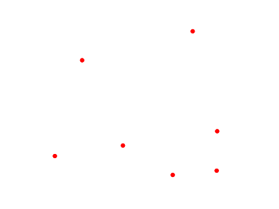
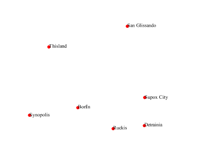
The points layer used for the examples below contains name and population information for the major cities of a fictional country. For reference, the attribute table for the points in this layer is included below.
fid (Feature ID) |
name (City name) |
pop (Population) |
point.1 |
Borfin |
157860 |
point.2 |
Supox City |
578231 |
point.3 |
Ruckis |
98159 |
point.4 |
Thisland |
34879 |
point.5 |
Synopolis |
24567 |
point.6 |
San Glissando |
76024 |
point.7 |
Detrania |
205609 |
Simple point
This example specifies points be styled as red circles with a diameter of 6 pixels.
Simple point
Code
View and download the full "Simple point" SLD
 1   <FeatureTypeStyle>
 2     <Rule>
 3       <PointSymbolizer>
 4         <Graphic>
 5           <Mark>
 6             <WellKnownName>circle</WellKnownName>
 7             <Fill>
 8               <CssParameter name="fill">#FF0000</CssParameter>
 9             </Fill>
10           </Mark>
11           <Size>6</Size>
12         </Graphic>
13       </PointSymbolizer>
14     </Rule>
15   </FeatureTypeStyle>
Details
There is one <Rule> in one <FeatureTypeStyle> for this SLD, which is the simplest possible situation. (All subsequent examples will contain one <Rule> and one <FeatureTypeStyle> unless otherwise specified.) Styling points is accomplished via the <PointSymbolizer> (lines 3-13). Line 6 specifies the shape of the symbol to be a circle, with line 8 determining the fill color to be red (#FF0000). Line 11 sets the size (diameter) of the graphic to be 6 pixels.
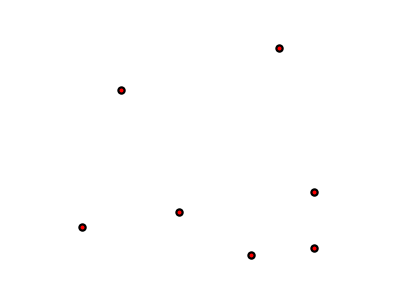
Simple point with stroke
This example adds a stroke (or border) around the Simple point, with the stroke colored black and given a thickness of 2 pixels.
Simple point with stroke
Code
View and download the full "Simple point with stroke" SLD
 1   <FeatureTypeStyle>
 2     <Rule>
 3       <PointSymbolizer>
 4         <Graphic>
 5           <Mark>
 6             <WellKnownName>circle</WellKnownName>
 7             <Fill>
 8               <CssParameter name="fill">#FF0000</CssParameter>
 9             </Fill>
10             <Stroke>
11               <CssParameter name="stroke">#000000</CssParameter>
12               <CssParameter name="stroke-width">2</CssParameter>
13             </Stroke>
14           </Mark>
15           <Size>6</Size>
16         </Graphic>
17       </PointSymbolizer>
18     </Rule>
19   </FeatureTypeStyle>
Details
This example is similar to the Simple point example. Lines 10-13 specify the stroke, with line 11 setting the color to black (#000000) and line 12 setting the width to 2 pixels.
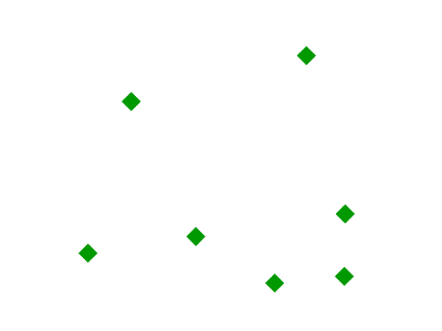
Rotated square
This example creates a square instead of a circle, colors it green, sizes it to 12 pixels, and rotates it by 45 degrees.
Rotated square
Code
View and download the full "Rotated square" SLD
 1   <FeatureTypeStyle>
 2     <Rule>
 3       <PointSymbolizer>
 4         <Graphic>
 5           <Mark>
 6             <WellKnownName>square</WellKnownName>
 7             <Fill>
 8               <CssParameter name="fill">#009900</CssParameter>
 9             </Fill>
10           </Mark>
11           <Size>12</Size>
12           <Rotation>45</Rotation>
13         </Graphic>
14       </PointSymbolizer>
15     </Rule>
16   </FeatureTypeStyle>
Details
In this example, line 6 sets the shape to be a square, with line 8 setting the color to a dark green (#009900). Line 11 sets the size of the square to be 12 pixels, and line 12 set the rotation is to 45 degrees.
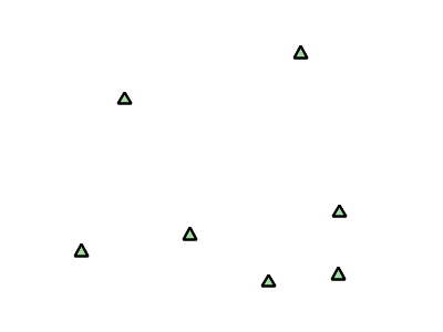
Transparent triangle
This example draws a triangle, creates a black stroke identical to the Simple point with stroke example, and sets the fill of the triangle to 20% opacity (mostly transparent).
Transparent triangle
Code
View and download the full "Transparent triangle" SLD
 1   <FeatureTypeStyle>
 2     <Rule>
 3       <PointSymbolizer>
 4         <Graphic>
 5           <Mark>
 6             <WellKnownName>triangle</WellKnownName>
 7             <Fill>
 8               <CssParameter name="fill">#009900</CssParameter>
 9               <CssParameter name="fill-opacity">0.2</CssParameter>
10             </Fill>
11             <Stroke>
12               <CssParameter name="stroke">#000000</CssParameter>
13               <CssParameter name="stroke-width">2</CssParameter>
14             </Stroke>
15           </Mark>
16           <Size>12</Size>
17         </Graphic>
18       </PointSymbolizer>
19     </Rule>
20   </FeatureTypeStyle>
Details
In this example, line 6 once again sets the shape, in this case to a triangle. Line 8 sets the fill color to a dark green (#009900) and line 9 sets the opacity to 0.2 (20% opaque). An opacity value of 1 means that the shape is drawn 100% opaque, while an opacity value of 0 means that the shape is drawn 0% opaque, or completely transparent. The value of 0.2 (20% opaque) means that the fill of the points partially takes on the color and style of whatever is drawn beneath it. In this example, since the background is white, the dark green looks lighter. Were the points imposed on a dark background, the resulting color would be darker. Lines 12-13 set the stroke color to black (#000000) and width to 2 pixels. Finally, line 16 sets the size of the point to be 12 pixels in diameter.
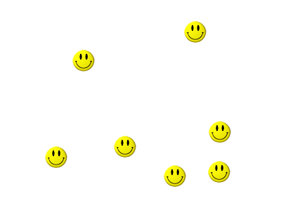
Point as graphic
This example styles each point as a graphic instead of as a simple shape.
Point as graphic
Code
View and download the full "Point as graphic" SLD
 1   <FeatureTypeStyle>
 2     <Rule>
 3       <PointSymbolizer>
 4         <Graphic>
 5           <ExternalGraphic>
 6             <OnlineResource
 7               xlink:type="simple"
 8               xlink:href="smileyface.png" />
 9             <Format>image/png</Format>
10           </ExternalGraphic>
11           <Size>32</Size>
12         </Graphic>
13       </PointSymbolizer>
14     </Rule>
15   </FeatureTypeStyle>
Details
This style uses a graphic instead of a simple shape to render the points. In SLD, this is known as an <ExternalGraphic>, to distinguish it from the commonly-used shapes such as squares and circles that are “internal” to the renderer. Lines 5-10 specify the details of this graphic. Line 8 sets the path and file name of the graphic, while line 9 indicates the format (MIME type) of the graphic (image/png). In this example, the graphic is contained in the same directory as the SLD, so no path information is necessary in line 8, although a full URL could be used if desired. Line 11 determines the size of the displayed graphic; this can be set independently of the dimensions of the graphic itself, although in this case they are the same (32 pixels). Should a graphic be rectangular, the <Size> value will apply to the height of the graphic only, with the width scaled proportionally.

Graphic used for points
Point with default label
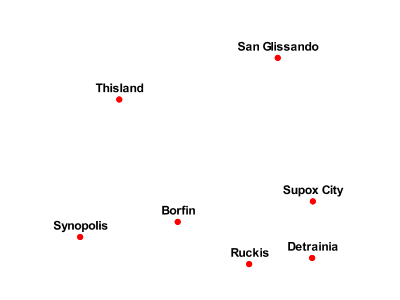
This example shows a text label on the Simple point that displays the “name” attribute of the point. This is how a label will be displayed in the absence of any other customization.
Point with default label
Code
View and download the full "Point with default label" SLD
 1   <FeatureTypeStyle>
 2     <Rule>
 3       <PointSymbolizer>
 4         <Graphic>
 5           <Mark>
 6             <WellKnownName>circle</WellKnownName>
 7             <Fill>
 8               <CssParameter name="fill">#FF0000</CssParameter>
 9             </Fill>
10           </Mark>
11           <Size>6</Size>
12         </Graphic>
13       </PointSymbolizer>
14       <TextSymbolizer>
15         <Label>
16           <ogc:PropertyName>name</ogc:PropertyName>
17         </Label>
18         <Fill>
19           <CssParameter name="fill">#000000</CssParameter>
20         </Fill>
21       </TextSymbolizer>
22     </Rule>
23   </FeatureTypeStyle>
Details
Lines 3-13, which contain the <PointSymbolizer>, are identical to the Simple point example above. The label is set in the <TextSymbolizer> on lines 14-27. Lines 15-17 determine what text to display in the label, which in this case is the value of the “name” attribute. (Refer to the attribute table in the Example points layer section if necessary.) Line 19 sets the text color. All other details about the label are set to the renderer default, which here is Times New Roman font, font color black, and font size of 10 pixels. The bottom left of the label is aligned with the center of the point.
Point with styled label
This example improves the label style from the Point with default label example by centering the label above the point and providing a different font name and size.
Point with styled label
Code
View and download the full "Point with styled label" SLD
 1   <FeatureTypeStyle>
 2     <Rule>
 3       <PointSymbolizer>
 4         <Graphic>
 5           <Mark>
 6             <WellKnownName>circle</WellKnownName>
 7             <Fill>
 8               <CssParameter name="fill">#FF0000</CssParameter>
 9             </Fill>
10           </Mark>
11           <Size>6</Size>
12         </Graphic>
13       </PointSymbolizer>
14       <TextSymbolizer>
15         <Label>
16           <ogc:PropertyName>name</ogc:PropertyName>
17         </Label>
18         <Font>
19           <CssParameter name="font-family">Arial</CssParameter>
20           <CssParameter name="font-size">12</CssParameter>
21           <CssParameter name="font-style">normal</CssParameter>
22           <CssParameter name="font-weight">bold</CssParameter>
23         </Font>
24         <LabelPlacement>
25           <PointPlacement>
26             <AnchorPoint>
27               <AnchorPointX>0.5</AnchorPointX>
28               <AnchorPointY>0.0</AnchorPointY>
29             </AnchorPoint>
30             <Displacement>
31               <DisplacementX>0</DisplacementX>
32               <DisplacementY>5</DisplacementY>
33             </Displacement>
34           </PointPlacement>
35         </LabelPlacement>
36         <Fill>
37           <CssParameter name="fill">#000000</CssParameter>
38         </Fill>
39       </TextSymbolizer>
40     </Rule>
41   </FeatureTypeStyle>
Details
In this example, lines 3-13 are identical to the Simple point example above. The <TextSymbolizer> on lines 14-39 contains many more details about the label styling than the previous example, Point with default label. Lines 15-17 once again specify the “name” attribute as text to display. Lines 18-23 set the font information: line 19 sets the font family to be “Arial”, line 20 sets the font size to 12, line 21 sets the font style to “normal” (as opposed to “italic” or “oblique”), and line 22 sets the font weight to “bold” (as opposed to “normal”). Lines 24-35 (<LabelPlacement>) determine the placement of the label relative to the point. The <AnchorPoint> (lines 26-29) sets the point of intersection between the label and point, which here (line 27-28) sets the point to be centered (0.5) horizontally axis and bottom aligned (0.0) vertically with the label. There is also <Displacement> (lines 30-33), which sets the offset of the label relative to the line, which in this case is 0 pixels horizontally (line 31) and 5 pixels vertically (line 32). Finally, line 37 sets the font color of the label to black (#000000).
The result is a centered bold label placed slightly above each point.
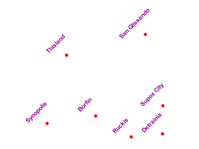
Point with rotated label
This example builds on the previous example, Point with styled label, by rotating the label by 45 degrees, positioning the labels farther away from the points, and changing the color of the label to purple.
Point with rotated label
Code
View and download the full "Point with rotated label" SLD
 1   <FeatureTypeStyle>
 2     <Rule>
 3       <PointSymbolizer>
 4         <Graphic>
 5           <Mark>
 6             <WellKnownName>circle</WellKnownName>
 7             <Fill>
 8               <CssParameter name="fill">#FF0000</CssParameter>
 9             </Fill>
10           </Mark>
11           <Size>6</Size>
12         </Graphic>
13       </PointSymbolizer>
14       <TextSymbolizer>
15         <Label>
16           <ogc:PropertyName>name</ogc:PropertyName>
17         </Label>
18         <Font>
19           <CssParameter name="font-family">Arial</CssParameter>
20           <CssParameter name="font-size">12</CssParameter>
21           <CssParameter name="font-style">normal</CssParameter>
22           <CssParameter name="font-weight">bold</CssParameter>
23         </Font>
24         <LabelPlacement>
25           <PointPlacement>
26             <AnchorPoint>
27               <AnchorPointX>0.5</AnchorPointX>
28               <AnchorPointY>0.0</AnchorPointY>
29             </AnchorPoint>
30             <Displacement>
31               <DisplacementX>0</DisplacementX>
32               <DisplacementY>25</DisplacementY>
33             </Displacement>
34             <Rotation>-45</Rotation>
35           </PointPlacement>
36         </LabelPlacement>
37         <Fill>
38           <CssParameter name="fill">#990099</CssParameter>
39         </Fill>
40       </TextSymbolizer>
41     </Rule>
42   </FeatureTypeStyle>
Details
This example is similar to the Point with styled label, but there are three important differences. Line 32 specifies 25 pixels of vertical displacement. Line 34 specifies a rotation of “-45” or 45 degrees counter-clockwise. (Rotation values increase clockwise, which is why the value is negative.) Finally, line 38 sets the font color to be a shade of purple (#99099).
Note that the displacement takes effect before the rotation during rendering, so in this example, the 25 pixel vertical displacement is itself rotated 45 degrees.
Attribute-based point
This example alters the size of the symbol based on the value of the population (“pop”) attribute.
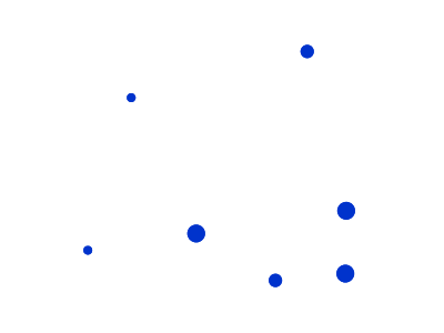
Attribute-based point
Code
View and download the full "Attribute-based point" SLD
 1   <FeatureTypeStyle>
 2     <Rule>
 3       <Name>SmallPop</Name>
 4       <Title>1 to 50000</Title>
 5       <ogc:Filter>
 6         <ogc:PropertyIsLessThan>
 7           <ogc:PropertyName>pop</ogc:PropertyName>
 8           <ogc:Literal>50000</ogc:Literal>
 9         </ogc:PropertyIsLessThan>
10       </ogc:Filter>
11       <PointSymbolizer>
12         <Graphic>
13           <Mark>
14             <WellKnownName>circle</WellKnownName>
15             <Fill>
16               <CssParameter name="fill">#0033CC</CssParameter>
17             </Fill>
18           </Mark>
19           <Size>8</Size>
20         </Graphic>
21       </PointSymbolizer>
22     </Rule>
23     <Rule>
24       <Name>MediumPop</Name>
25       <Title>50000 to 100000</Title>
26       <ogc:Filter>
27         <ogc:And>
28           <ogc:PropertyIsGreaterThanOrEqualTo>
29             <ogc:PropertyName>pop</ogc:PropertyName>
30             <ogc:Literal>50000</ogc:Literal>
31           </ogc:PropertyIsGreaterThanOrEqualTo>
32           <ogc:PropertyIsLessThan>
33             <ogc:PropertyName>pop</ogc:PropertyName>
34             <ogc:Literal>100000</ogc:Literal>
35           </ogc:PropertyIsLessThan>
36         </ogc:And>
37       </ogc:Filter>
38       <PointSymbolizer>
39         <Graphic>
40           <Mark>
41             <WellKnownName>circle</WellKnownName>
42             <Fill>
43               <CssParameter name="fill">#0033CC</CssParameter>
44             </Fill>
45           </Mark>
46           <Size>12</Size>
47         </Graphic>
48       </PointSymbolizer>
49     </Rule>
50     <Rule>
51       <Name>LargePop</Name>
52       <Title>Greater than 100000</Title>
53       <ogc:Filter>
54         <ogc:PropertyIsGreaterThanOrEqualTo>
55           <ogc:PropertyName>pop</ogc:PropertyName>
56           <ogc:Literal>100000</ogc:Literal>
57         </ogc:PropertyIsGreaterThanOrEqualTo>
58       </ogc:Filter>
59       <PointSymbolizer>
60         <Graphic>
61           <Mark>
62             <WellKnownName>circle</WellKnownName>
63             <Fill>
64               <CssParameter name="fill">#0033CC</CssParameter>
65             </Fill>
66           </Mark>
67           <Size>16</Size>
68         </Graphic>
69       </PointSymbolizer>
70     </Rule>
71   </FeatureTypeStyle>
Details
Note
Refer to the Example points layer to see the attributes for this data. This example has eschewed labels in order to simplify the style, but you can refer to the example Point with styled label to see which attributes correspond to which points.
This style contains three rules. Each <Rule> varies the style based on the value of the population (“pop”) attribute for each point, with smaller values yielding a smaller circle, and larger values yielding a larger circle.
The three rules are designed as follows:
Rule order |
Rule name |
Population (“pop”) |
Size |
1 |
SmallPop |
Less than 50,000 |
8 |
2 |
MediumPop |
50,000 to 100,000 |
12 |
3 |
LargePop |
Greater than 100,000 |
16 |
The order of the rules does not matter in this case, since each shape is only rendered by a single rule.
The first rule, on lines 2-22, specifies the styling of those points whose population attribute is less than 50,000. Lines 5-10 set this filter, with lines 6-9 setting the “less than” filter, line 7 denoting the attribute (“pop”), and line 8 the value of 50,000. The symbol is a circle (line 14), the color is dark blue (#0033CC, on line 16), and the size is 8 pixels in diameter (line 19).
The second rule, on lines 23-49, specifies a style for points whose population attribute is greater than or equal to 50,000 and less than 100,000. The population filter is set on lines 26-37. This filter is longer than in the first rule because two criteria need to be specified instead of one: a “greater than or equal to” and a “less than” filter. Notice the And on line 27 and line 36. This mandates that both filters need to be true for the rule to be applicable. The size of the graphic is set to 12 pixels on line 46. All other styling directives are identical to the first rule.
The third rule, on lines 50-70, specifies a style for points whose population attribute is greater than or equal to 100,000. The population filter is set on lines 53-58, and the only other difference is the size of the circle, which in this rule (line 67) is 16 pixels.
The result of this style is that cities with larger populations have larger points.
Zoom-based point
This example alters the style of the points at different zoom levels.
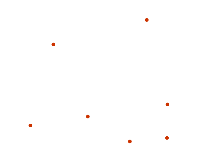
Zoom-based point: Zoomed in
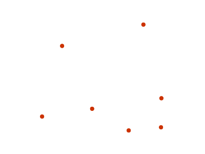
Zoom-based point: Partially zoomed
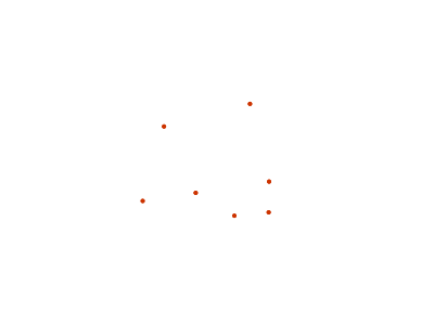
Zoom-based point: Zoomed out
Code
View and download the full "Zoom-based point" SLD
 1   <FeatureTypeStyle>
 2     <Rule>
 3       <Name>Large</Name>
 4       <MaxScaleDenominator>160000000</MaxScaleDenominator>
 5       <PointSymbolizer>
 6         <Graphic>
 7           <Mark>
 8             <WellKnownName>circle</WellKnownName>
 9             <Fill>
10               <CssParameter name="fill">#CC3300</CssParameter>
11             </Fill>
12           </Mark>
13           <Size>12</Size>
14         </Graphic>
15       </PointSymbolizer>
16     </Rule>
17     <Rule>
18       <Name>Medium</Name>
19       <MinScaleDenominator>160000000</MinScaleDenominator>
20       <MaxScaleDenominator>320000000</MaxScaleDenominator>
21       <PointSymbolizer>
22         <Graphic>
23           <Mark>
24             <WellKnownName>circle</WellKnownName>
25             <Fill>
26               <CssParameter name="fill">#CC3300</CssParameter>
27             </Fill>
28           </Mark>
29           <Size>8</Size>
30         </Graphic>
31       </PointSymbolizer>
32     </Rule>
33     <Rule>
34       <Name>Small</Name>
35       <MinScaleDenominator>320000000</MinScaleDenominator>
36       <PointSymbolizer>
37         <Graphic>
38           <Mark>
39             <WellKnownName>circle</WellKnownName>
40             <Fill>
41               <CssParameter name="fill">#CC3300</CssParameter>
42             </Fill>
43           </Mark>
44           <Size>4</Size>
45         </Graphic>
46       </PointSymbolizer>
47     </Rule>
48   </FeatureTypeStyle>
Details
It is often desirable to make shapes larger at higher zoom levels when creating a natural-looking map. This example styles the points to vary in size based on the zoom level (or more accurately, scale denominator). Scale denominators refer to the scale of the map. A scale denominator of 10,000 means the map has a scale of 1:10,000 in the units of the map projection.
Note
Determining the appropriate scale denominators (zoom levels) to use is beyond the scope of this example.
This style contains three rules. The three rules are designed as follows:
Rule order |
Rule name |
Scale denominator |
Point size |
1 |
Large |
1:160,000,000 or less |
12 |
2 |
Medium |
1:160,000,000 to 1:320,000,000 |
8 |
3 |
Small |
Greater than 1:320,000,000 |
4 |
The order of these rules does not matter since the scales denominated in each rule do not overlap.
The first rule (lines 2-16) is for the smallest scale denominator, corresponding to when the view is “zoomed in”. The scale rule is set on line 4, so that the rule will apply to any map with a scale denominator of 160,000,000 or less. The rule draws a circle (line 8), colored red (#CC3300 on line 10) with a size of 12 pixels (line 13).
The second rule (lines 17-32) is the intermediate scale denominator, corresponding to when the view is “partially zoomed”. The scale rules are set on lines 19-20, so that the rule will apply to any map with a scale denominator between 160,000,000 and 320,000,000. (The <MinScaleDenominator> is inclusive and the <MaxScaleDenominator> is exclusive, so a zoom level of exactly 320,000,000 would not apply here.) Aside from the scale, the only difference between this rule and the first is the size of the symbol, which is set to 8 pixels on line 29.
The third rule (lines 33-47) is the largest scale denominator, corresponding to when the map is “zoomed out”. The scale rule is set on line 35, so that the rule will apply to any map with a scale denominator of 320,000,000 or more. Again, the only other difference between this rule and the others is the size of the symbol, which is set to 4 pixels on line 44.
The result of this style is that points are drawn larger as one zooms in and smaller as one zooms out.